Channel Platform: Powering the Airtel app
Updated: Sep 2
Redesigning the tool that runs Airtel's app — twice — as it scaled to 20 million DAUs
My role: Sole designer → Design lead, across two ground-up redesigns
The Challenge
Channel Platform is the internal tool used by Airtel’s engineering and growth teams to build and launch screens across the Airtel app including recharge flows, category pages, homepage and most core journeys.
It is backed by Airtel’s design system and now powers the entire app, serving 120 million monthly active users.
The challenge was not just redesigning the tool. It was keeping the tool easy to use as the app grew. At the same time, the design system underneath it had to stay intact.
I’ve led two ground-up redesigns of Channel Platform. Each redesign happened because the previous solution had outgrown itself.
My Role
By the time I worked on Channel Platform’s first redesign, I had been at Airtel for a year. Its original version was already in place when I joined. It was an engineering-led tool, built before design had much influence over how it was made.
I led the first redesign myself, as the platform’s only designer. After two years when that version hit its limits at scale, I led the redesign again. This time, I was the design lead, with one designer maintaining the live system while I envisioned what came next.
Redesign One: From Hard-Coded Pages to a Shared Language
Originally, every page's frontend in Channel Platform was hard coded. There was no design system connected to it. The interface was deeply nested, with collapsible sections inside other sections. It was hard to know where you were.
Growth teams struggled the most. They needed to move fast, but the tool took time to learn. By the time someone learned how to use it, they would often move to another team. The next person would then need to be trained from scratch.
There were also no guardrails. Every change went live instantly. A wrong edit to one cohorted page could take down a live experience and force a rollback.
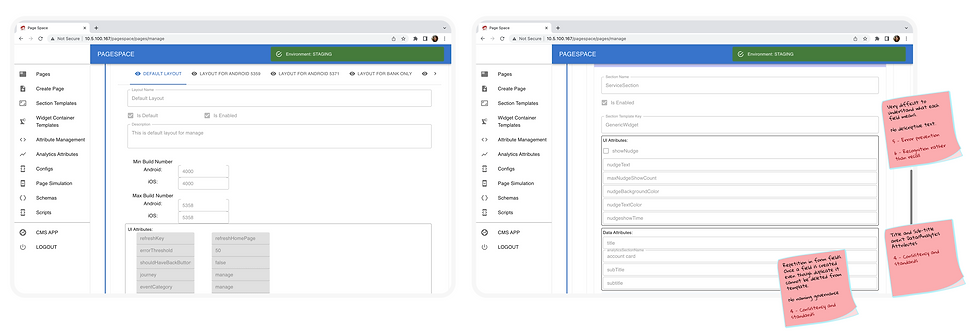
The original nested, code-based interface
This led to two key design decisions:
1. Make navigation easier
I replaced the nested accordions with three persistent columns showing the page hierarchy side by side. I also added breadcrumbs and visual previews at both widget and page level.
The goal was to help people recognise where they were instead of remembering how to get there.

New structure IA & Navigation
2. Add guardrails where they mattered
I did not add approvals to every change. Most edits stayed instant because speed was important for growth teams.
Instead, I added an approval step only for structural changes. These were the changes that had previously broken cohort pages.

Nested collapsed panels with previews
For the widgets, I suggested the engineering library to be synced 1:1 from Airtel’s Figma design system.
The journey designer decided what became a widget during the design process. The design system team governed these decisions centrally.
The System Outgrew Itself
The governance model kept the design side consistent, but there was no equivalent check on the engineering side. This is where the system started to break. Design stayed disciplined. Every widget update went back to one source of truth, managed by one Design System team. But each widget was still a fixed unit. So even a small new requirement, like adding one more line of text, often meant creating a new widget instead of updating an existing one.
Engineering had no system to prevent this.
Interviews with engineering and growth teams, along with a full audit, showed a fragmented setup with inconsistent naming. Engineers often could not find out if a suitable widget already existed. Even when they knew one existed, many still built a copy. Changing a live widget meant testing it everywhere it was used. That made a small change take a long time.
For an individual engineer, duplicating a widget was faster and safer. Across the organisation, it had the opposite effect.
We ended up with roughly 400 widgets where 40 would have been enough. Many were slightly different from each other, and none were fully trusted.
This was not a maintenance problem that could be fixed by cleaning things up.
The underlying model was encouraging duplication. Nothing in the way widgets were built or governed was designed to stop it.
Redesign Two: Building for Flexibility, Not Just Structure
The core decision was to define what could change and what could not. A fixed widget left very little room to adapt. Even adding a button or heading could mean building a new widget.
Instead, components now have a defined set of properties that can be adjusted. Adding a button or heading becomes a configuration choice within the layout, not a new build.
The structure stays consistent. What can change is deliberate and controlled.

Widgets, Components with previews
Getting there was not a one-time cleanup. The design system team reduced its library from 52 widgets to 38. Engineering then spent six months updating pages to use the cleaned-up set and deprecating duplicates along the way.
I first ruled out lighter fixes such as cleaning the widgets, better tagging, splitting the library and usage audits. These would have made 400 widgets easier to navigate, but would not have addressed why people kept creating new ones.
To prevent the problem from coming back, components now sync directly from the design system library. It is a live replica, not a manual copy, so the two systems cannot drift apart.
Naming was also aligned across both systems. One-off instances were removed and duplicates were merged.
The system is not perfect. Hard-coded overrides still show up occasionally when an old page is changed. We fix these as we find them.
The key difference is that the system now makes duplication harder to repeat. It is not just discouraged.

A page being composed from widgets, drag-and-drop

The resistance was not about the idea. Engineering teams were frustrated with the existing setup too and wanted a way out. The bigger issue was ownership. Teams that had already rebuilt parts of the live app on Channel Platform did not want to own new components as well. So new requirements kept getting pushed back to the central platform team.
That question is still not fully settled. But it comes up much less now. Most new needs can be built by composing existing components, without creating or owning something new.
Impact & What's Next
The redesign reduced Channel Platform’s build-to-launch cycle from 15 days to 8 days.
It also freed many changes from the app’s release cycle. Teams could update live experiences directly. This made experimentation faster and cheaper for growth teams.
Looking back, the same principle guided both redesigns:
Do not rely on people remembering a rule.
Change the system so the old failure is harder to repeat.
Persistent hierarchy reduced the need to remember where things were. Visual previews reduced the need to guess what a widget would look like. Approvals were added based on risk, rather than applied to every change. Live syncing replaced copies that could drift over time. None of these solutions added more process. They changed the system so the safer path was also the easier path.
Channel Platform is still evolving. We are now exploring how AI can help assemble and reorganise layouts dynamically for different users, instead of keeping every page as one fixed composition.


