Airtel Business: A Blueprint you can Experience
Updated: Sep 2
Mapping Airtel Business’s B2B ecosystem from Acquisition to Delivery to Assurance on a 15-feet floor print, to find where the experience was actually breaking.
Initiative: End-to-end ecosystem blueprint across Acquisition, Delivery, and Assurance, used to build a one-year UX roadmap with 15 leaders across 12 functions
My role: Design Lead, initiated, mapped, and facilitated the exercise independently
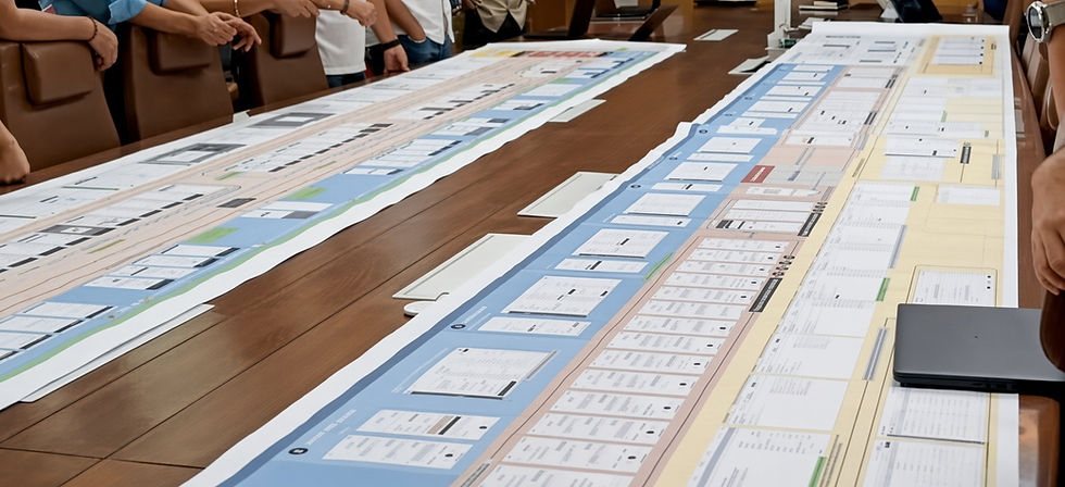
The full print laid out
The Challenge
Airtel Business manages enterprise accounts across three stages:
Acquisition: From finding a lead to booking the order
Delivery: Planning, provisioning, installing, and testing the service
Assurance: Monitoring the live service and resolving issues
Each stage has its own teams, tools, and handoffs. These teams are spread across the country. Most people only see the part they are responsible for. This created a clear problem. When something broke, people raised it with whoever they were in touch with, rather than the team that could actually fix it.
At the start of the Annual Operating Plan cycle, I set out to create a shared, end-to-end view of the ecosystem. The goal was to use this view to build a one-year UX roadmap, instead of continuing to solve problems stage by stage.
My Role
I was the Design Lead for Airtel Business, with a team of two designers focused on immediate requirements such as active fixes and ongoing feature work.
This initiative sat outside our workload. I took it up myself at the start of the AOP cycle to build the roadmap. I ran the workshops, created the 15-foot print on Figma, and facilitated the walkthroughs.
The Approach
I chose a physical format instead of a dashboard or deck. The map was printed on a 15-plus-foot floor print and designed to be walked, not reviewed.
A dashboard lets people stay in their own area and look at their part of the process. Walking the map forced people to move through parts they had never worked on. They could physically see where a handoff broke instead of reading about it on a slide.
This changed the conversation from “this is my part” to “this is how it connects.”

The workshop in progress, people walking the print
The map followed the customer lifecycle from Acquisition to Delivery to Assurance.
Each phase showed:
The teams involved
The tools they used
Whether the handoff was digital or manual
What broke when the handoff was manual
How that issue reached the customer
This level of detail was important. A simple journey map would have shown the happy path. Mapping each team, tool, and handoff made the actual breakpoints visible.

Close-up of one phase, with team, tool, and handoff annotations
The workshop had 15 people across sales, legal, network, engineering, product and support.
My role was not just to present the map. I also had to manage the discussion. I let disagreements play out when they were uncovering a real issue, and redirected them when they were taking the group away from the walkthrough.
What It Surfaced
The clearest example was the handoff between Acquisition and Delivery.
Customers often had to explain their requirements again to the Delivery team, even after the sale was signed and the requirements were already in the contract.
The two teams worked from different offices and rarely interacted. This created gaps in information.
Sometimes, the hardware promised during the sale was no longer available when it was time to deliver. Acquisition had no visibility into what Delivery could source or when.
Neither team owned this gap. The customer ended up dealing with it.
The rest of the print showed the same pattern in other parts of the business.
There was no single view of an opportunity’s status or who was currently responsible for it.
When a Key Account Manager changed, the new KAM inherited old email folders instead of a clear account history.
Leadership had no live view of funnel movement, churn risk, or upcoming renewals. Forecasting depended on whoever could pull the numbers together fastest.

Annotated excerpt in Red Blocks and Pink strip at bottom showing breakpoints
The symptoms were different, but the root cause was the same.
Multiple handoffs ran through fragmented tools. Nothing connected them. Important information lived with individual people instead of in a shared system.
The people had become the infrastructure.
The Roadmap
Four priorities came out of the mapping:
Leadership dashboard: A single view of the funnel across all stages, with forecasting for what was likely to close.
Account dashboard: A clear account history for KAMs, replacing the need to search through old emails.
Assurance runbook: A standard MOP for Assurance to reduce repeat mistakes.
Funnel analytics: Connect analytics across different stages that had previously worked with separate data.
Impact
Most of the recommendations made it into that year’s product roadmap.
The new account-level profile received an 87% positive response from KAMs.
Within six months:
Every center had moved away from Excel for internal and leadership reporting and started using the new dashboards.
Field sales got a mobile app alongside their existing web login. They could now log meetings and notes on the spot instead of relying on memory later.
The redesigned Salesforce experience was simple enough that teams started moving away from their legacy tools voluntarily. This was harder to achieve than simply mandating the change.
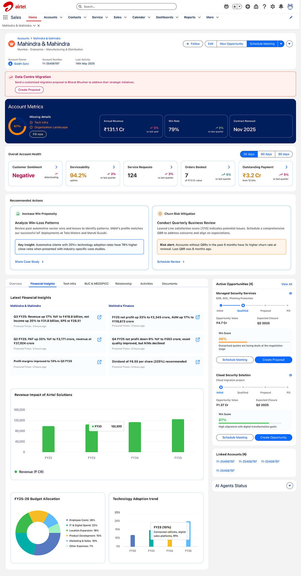
The KAM Account View

The Activiy Dashboard
Not everything moved forward.
Some of the supporting tools were legacy systems that could not be redesigned outright. A few proposed solutions had to be shelved.
Planning teams, in particular, still work across several disconnected tools.
The system is meaningfully better, but it is not finished.


